
ACE: Brand and Headquarters for 11 Agencies.
ACE — The brand case study
- Concept Development
- Brand Identity
- Brand Strategy
- HQ interior design
- Brand Identity
- Interior Design HQ
- Spatial Design
- Motion and 3D Behavior
- Sonic and Audio Branding
- Digital Experience
- Blockchain Technology
- Cultural Programming
Client - ACE
Role - Creative Director
Year - 2022
As an independent creative director I led a team of architects, designers, strategists and copywriters to bring 11 agencies together in a new brand identity and new headquarters in Amsterdam (NL). My role was to select and direct a group of creative studios, from concept to completion, ensuring a high degree of innovation, creativity and quality.
In close collaboration with Smörgåsbord Studio we established the ACE's strategy and translated it into a multi platform brand identity. The new ACE strategy and brand identity set the foundation for ACE’s presence in the physical and digital realm, including the architecture of the new headquarters, metaverse, sonic identity and community building.
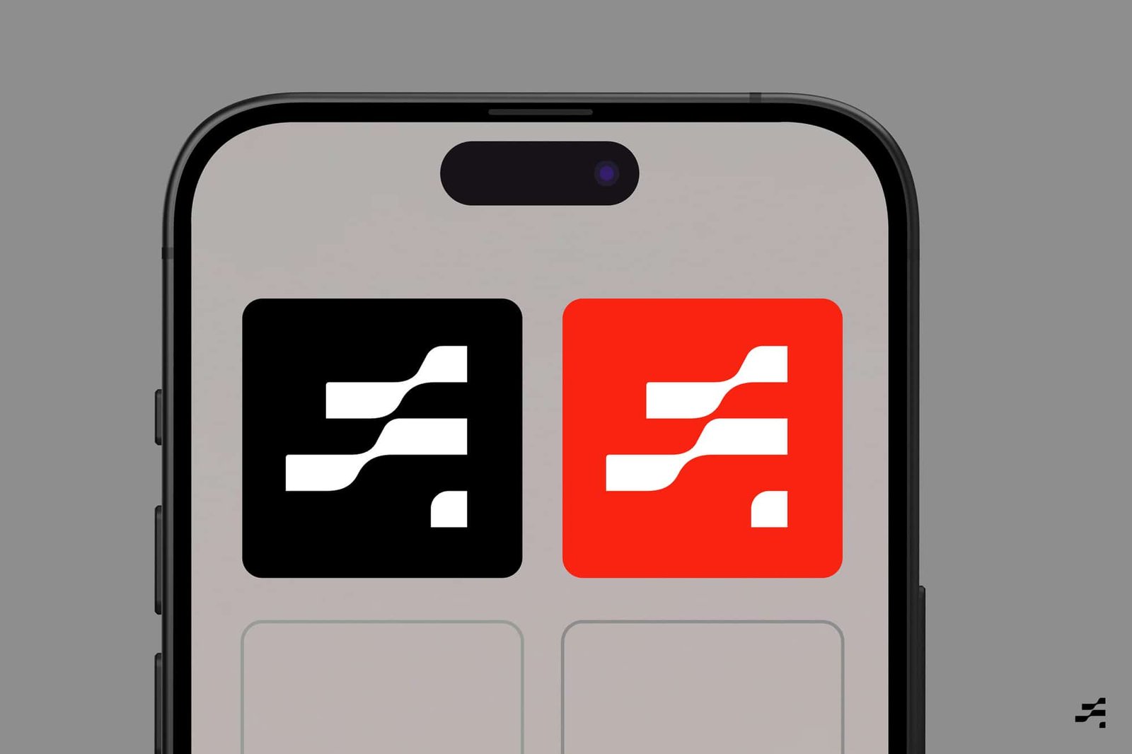
ACE Logo + Motion Behavior
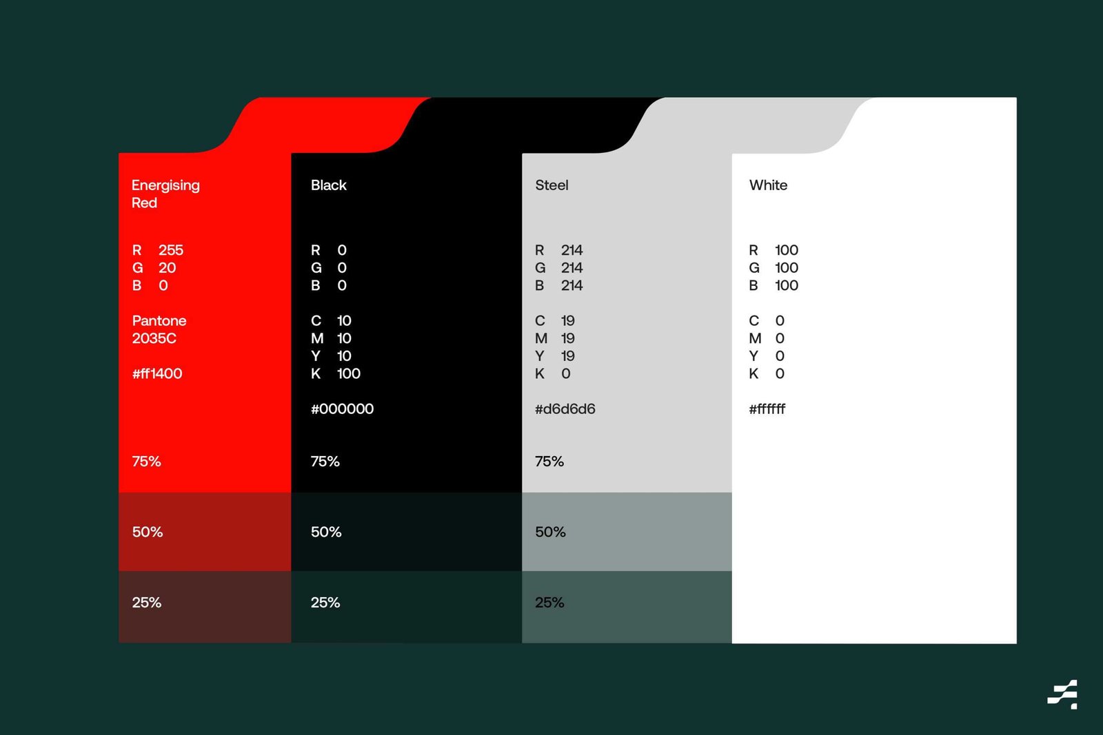
ACE stands for 'Authentic', 'Cultural', 'Energising' and is set to make waves for a brighter future.
ACE is a family of creative agencies on a mission to activate positive change for people and brands. The new brand encapsulates the fresh perspectives that are in tune with current culture, society and technology. A collective that sparks conversations with exciting ideas, energised by curiosity and with the desire to create memorable work.
Authentic - This is at the heart of everything.
Cultured - Be relevant and well informed. At the very center of culture.
Energising - Emit positive energy and inspire those around us.
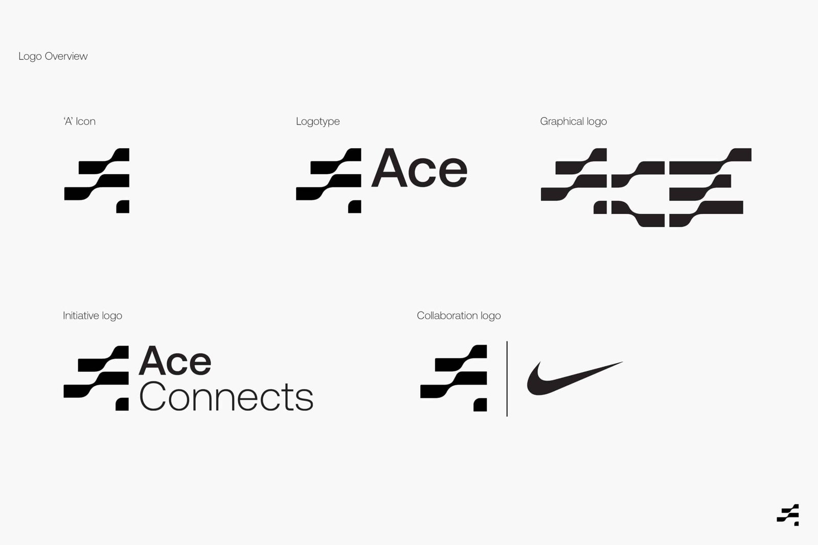
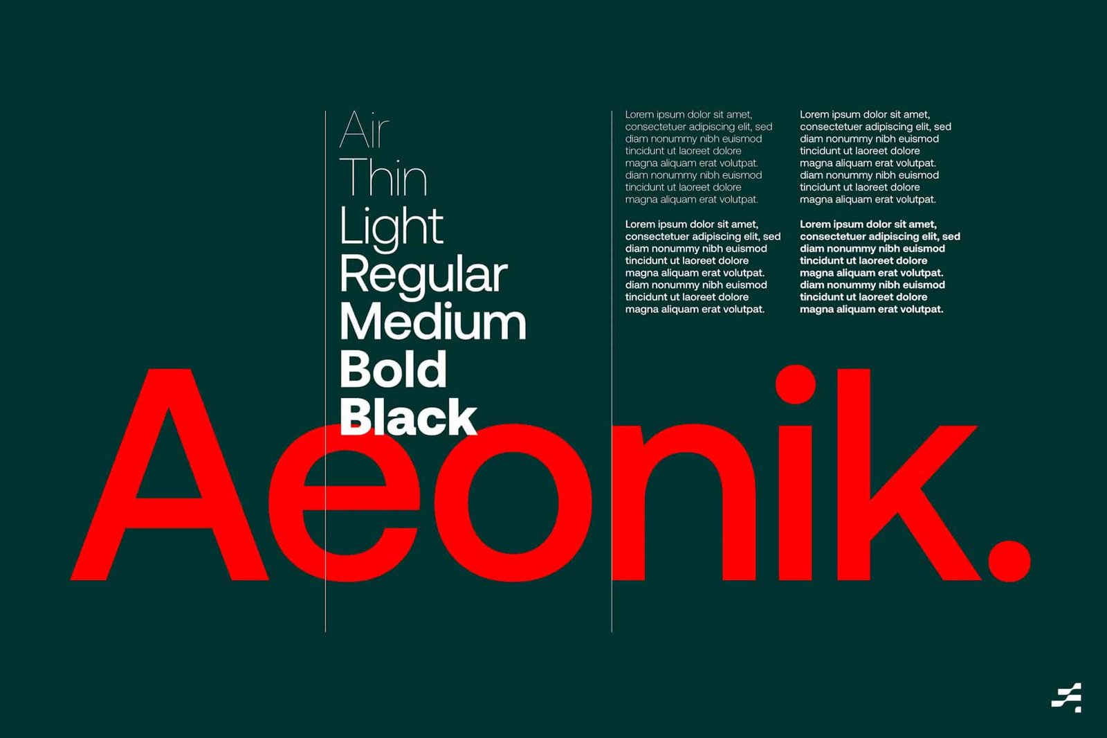
ACE — Brand Guidelines
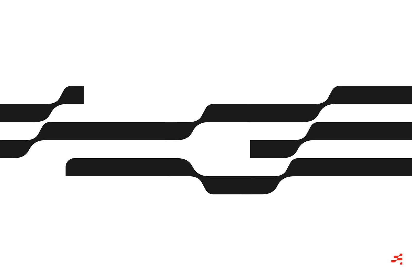
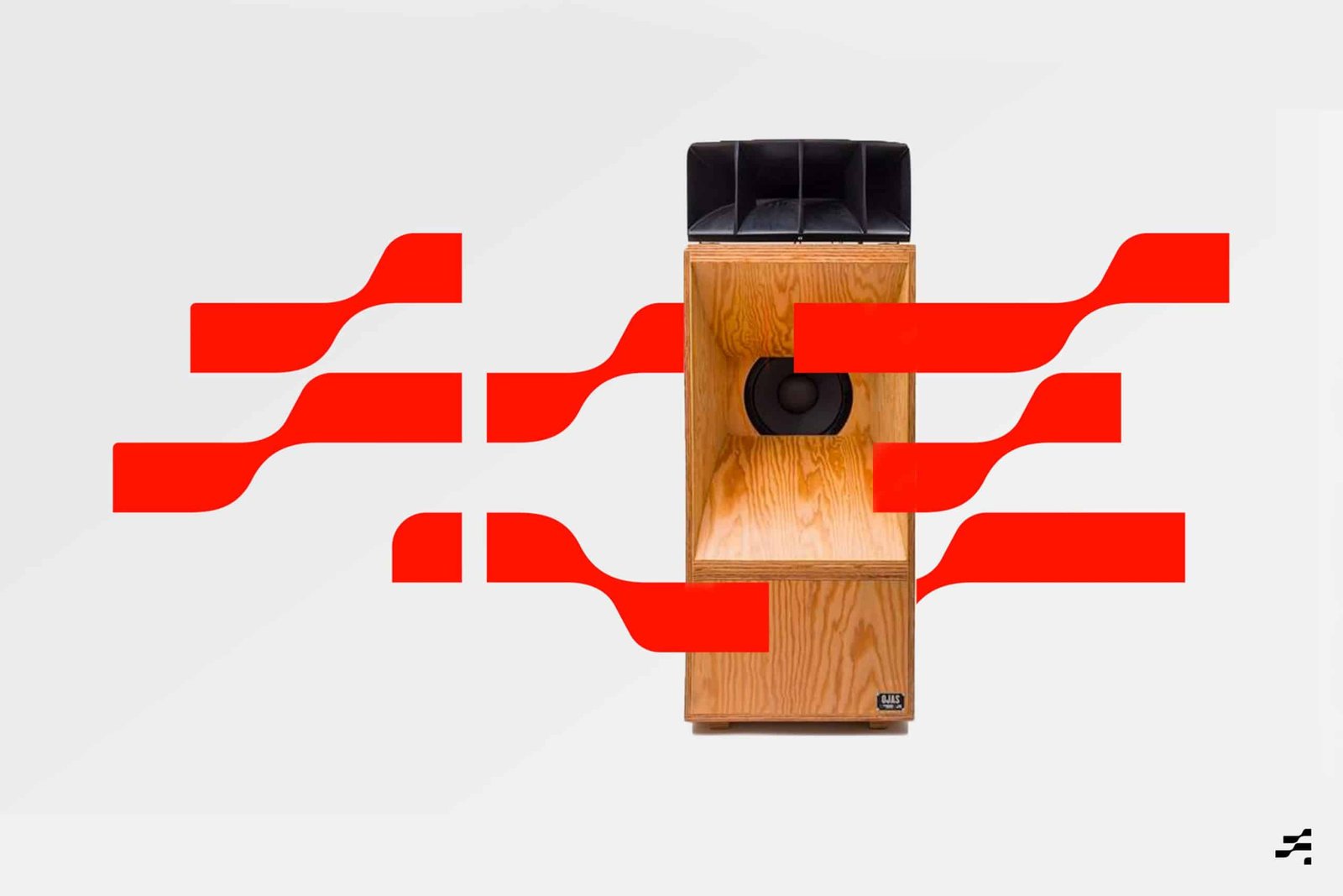
The graphical concept of "Making Waves"
The graphical concept of making waves is the starting point for all things aesthetic. Across all graphic comms (where appropriate) it creates the idea of 'making waves' which suggests it's forever in motion, always in progressing, bridging one generation to the next and making waves for a brighter future.
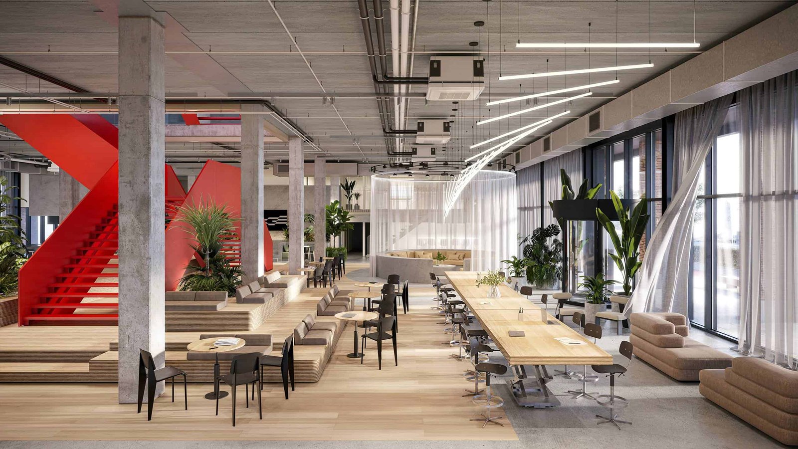

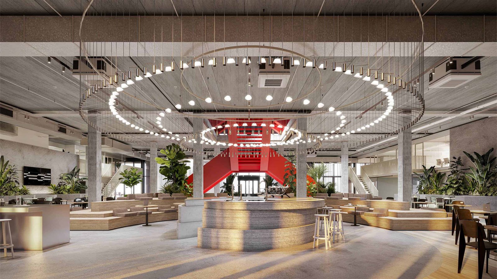
The brand strategy and identity set the foundation for the architecture of the new 4000sqm ACE headquarters.
Interior Design and Architecture
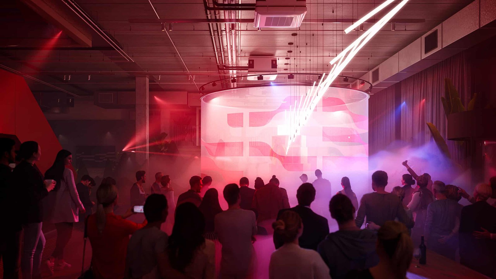
ACE's ground floor is a communal space where agency parties converge, create and socialise. It is also where clients and collaborators are welcomed. Our aim for this space was to remain authentic – in terms of design, material palette and furniture specification. Together with interior architects and designers from TANK and Smörgåsbord we created a place that will inspire a culture of positivity, creative energy and open-mindedness.
ACE - Headquarters in Amsterdam
The space for ACE
ACE initiates encouragement programs, creative workshops, inspiration sessions and recording facilities. Through 5x 'hero pieces' we want to spark new ideas and liberate thoughts in unexpected ways. The conversation pit, circular bar (and light sculpture), chef's table, scissor table and wooden seating podium are all big and monolithic in nature.
ACE — 'A' Icon - 3D liquid expression
'Making waves' through the creation of meaningful, culturally relevant and far reaching creative is a principle driver for ACE.
ACE — 3D Exploration

ACE — Digital experience
The photographic language of ACE is one that is a true representation of society. In front and behind the camera.
The photographic language of ACE is one that is a true representation of society. In front and behind the camera.
ACE works with upcoming talent, from different backgrounds in order to encourage, inspire and promote individual expression.
ACE — Iconography and wayfinding

ACE — The book featuring the ACE story, values and creative credo

ACE — Socials
ACE — Digital out of home
ACE — Presents, Cultural programming consisting of listening sessions, panels, interviews, workshops, dj sets, radio and films.

ACE — Electric Volkswagen ID. Buzz
Sonic Identity and Audio Branding
For ACE we envisioned a sound palette that conveys the feeling of people coming together. Heightening the sense of possibility and positivity. Inspired by pulsating heartbeats set in motion, we created an ever changing repetative beat. For human depth and layering we recorded physical instruments.
'A' Icon + Sonic Identity
Logo Type + Sonic Identity
New Initiatives + Sonic Identity
Ace Crypto Coin and Token
Introducing the ACE Crypto. The cryptocurrency that allows the company to involve employees in its development and growth built on the blockchain. The visual execution ties back into the core values of the brand featuring its energising colour.
ACE — Coin Energising Edition
ACE — Token Waves
Selected Press
The team
Art Director - Alex Frew
Project Manager - Celine Wagenmakers
Motion Designer - John Beckers // Freelance
https://www.smorgasbordstudio.com/work/ace/
Creative Director - Tommy Kleerekoper
Interior Architect - Sarah Rowling
Interior Architect - Eva Trip
Interior Architect - Vincent Heck
https://tank.nl/ace/
Executive Producer - Nina Fabel
Producer - Gayle van Bochove
Art Director - Roberto Andreau
Motion Designer - Hidde Maas
Senior Motion Designer - Ernst Noort
Motion Designer - Pascal Amestegui Fuentes
https://woodwork.nl/portfolio/ace/
Composer - Han Kerkhof
Emilio de Haan
Lisa Klop
Leroy Niemel
Henk Boersen
Hannes van Raaij
Coen Slothouber
Caroline van Eyck
Thanks to everyone who I collaborated with on this project.
Reach Out. Say Hi.
If you’re interested in any form of collaboration, say hello and let's craft ideas together.